 FoxInCloud V 2.24 with Bootstrap Integration released!
 FoxInCloud Support - Thierry N.
All
Mar 2, 2017 @ 06:25am
FoxInCloud 2.24 makes a Responsive Web App out of any VFP desktop app
FoxInCloud 2.24 integrates the most popular HTML, CSS, and JS framework for developing responsive, mobile first projects on the web: Bootstrap; HTML/CSS/JS using Bootstrap can display on any terminal size: smartphone, tablet, laptop and desktop.
Once adapted with FoxInCloud, deployed on the Web, your VFP application matches the latest standards of Web application: comfort of use, accessibility, latest trends in Web design and automatic adaptation to any screen size.
Complemented with Open Source Hybrid Application frameworks like Adobe Phonegap and Apache Cordova, any VFP Web application can now make its way in any of the popular application stores: Apple App Store, Android Google Play, Microsoft Store.
FoxInCloud brings these awesome new opportunities without any additional development, and without writing a single line of HTML, CSS or JS code: just assign a couple of properties in your VFP code.
For more information, please consult this blog post.
Sample form: desktop, classic and Bootstrap rendering
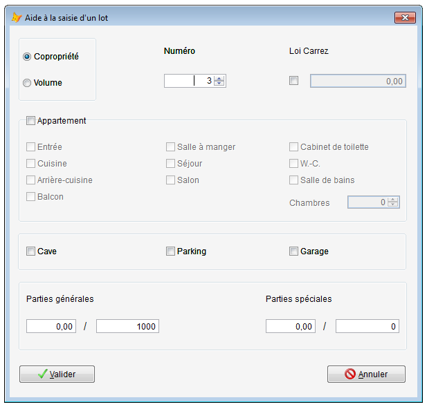
Original VFP form in desktop mode:
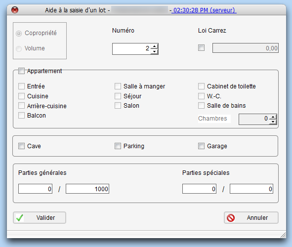
Web form with 'classic' FoxInCloud rendering (absolute positioning):
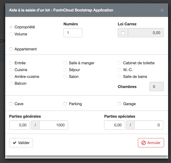
Web form with 'Bootstrap' rendering, viewed on a large screen
(notice the lines around controls matching the shapes in the original form, and the checkbox and '/' labels now grouped with the neighboring Textbox):
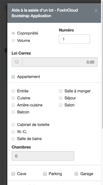
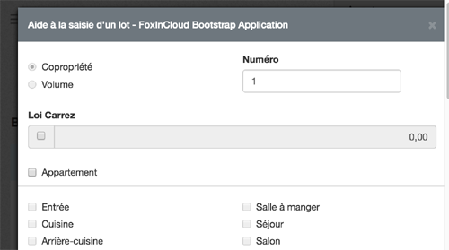
Web form with 'Bootstrap' rendering, viewed on a small screen such as a tablet:
Web form with 'Bootstrap' rendering, viewed on a very small screen like a smartphone: